DESIGN IN MOTION

/

FOIL STAMPING & EMBOSSING

SPECIAL
EFFECTS

PRINT & DIGITAL

VISUAL
COMMUNICATIONS

FROM START TO FINISH

CONSULTING &PRODUCTION

a

b

o

u

t

u

s

uS

SPECIAL
EFFECTS

DESIGN

Enhance appearance & increase perceived value

Use with preexisting artwork or collaborate with us

Added security measure to combat counterfeiting

DESIGN
IN
MOTION

Learn more about special effects design, our process, capabilities & applications.

CUSTOM
DESIGN

Collaborate on your project with us from scratch, or enhance your preexisting artwork with our custom special effects design.

THE POSSIBILITIES
ARE ENDLESS

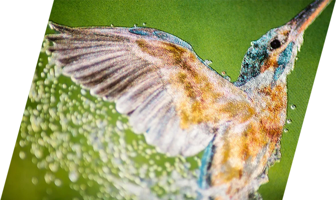
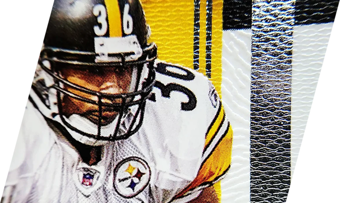
We offer a wide-variety of stock textures that can be scaled, foil stamped or blind embossed/debossed, in addition to center point and pattern motion effect designs.

We can even create custom repeatable textures, and center point and pattern motion effect designs that are one-of-a-kind and completely unique to your project, which also add a high level of security due to the extreme difficulty of duplication.

Contact us to discuss your project and request our MicroLine Design swatch book with over 50 stock textures, center point and pattern motion effect designs.


VIRTUAL
PROOFING

Our Virtual Proofing System allows you to view your Design in Motion™ with the click of a button.

This invaluable tool eliminates guess work and saves you valuable time and money before and during production.

Please note: Virtual Proofing simulations solely reflect the movement of our design work; actual results are based upon foil and substrate applications.

Simulation display may vary across devices. For optimal results, we recommend viewing at full scale on a high-resolution screen.

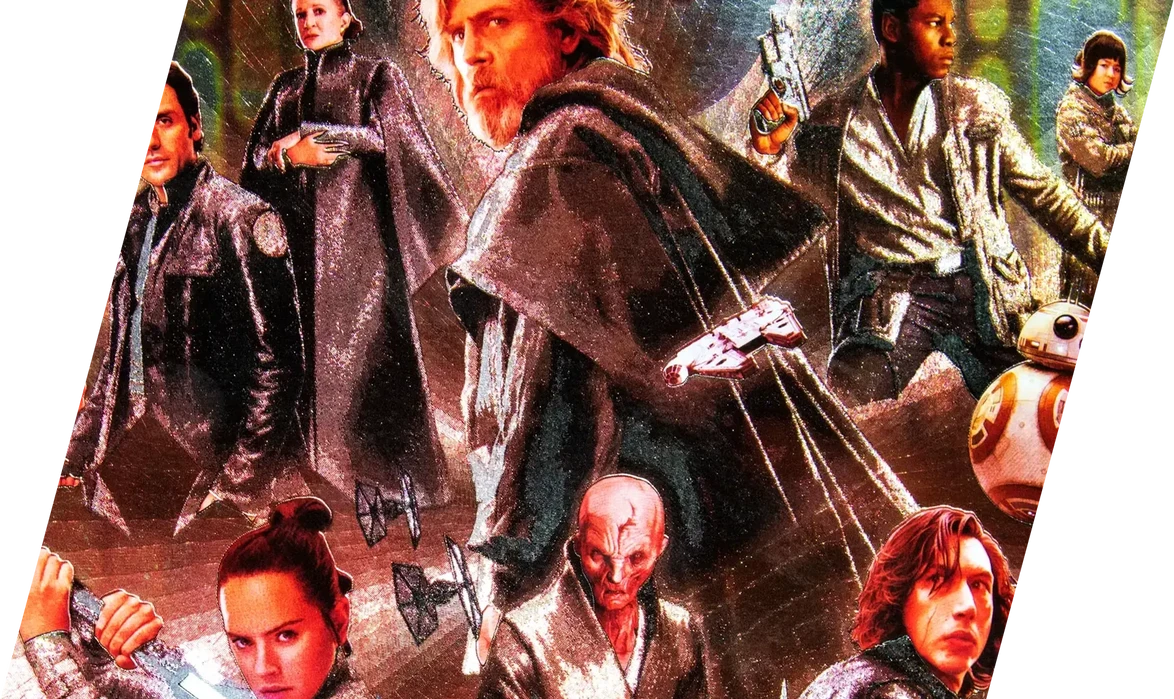
Design shown: MLD 218


STAR WARS GALAXY TRADING CARDS 2010 / property of topps COMPANY, INC.

MICROLINE
FOIL TEST DIE

Our MicroLine Foil Test Die consists of 15 line width variations, in addition to embossed and debossed examples, that allow you to test foil stamp and see which line quality is best suited for the foil application upon your chosen substrate.

Because not all substrates are the same, our Test Die saves time, money, and headaches by allowing you to choose which line quality is producing the most movement. This allows us to make adjustments in our design work to ensure we're achieving the optimal motion effect.

Save time and money in production and contact us to request artwork for your MicroLine Design Test Die.


© Copyright 2021 MicroLine Design, LLC

VISUAL
COMMUN
ICATIONS

Brand Identity

Marketing & Advertising

Print & Digital

Lorem ipsum dolor sit amet, consectetur adipiscing elit. Aenean in nulla quis dui ornare faucibus. Pellentesque non ipsum dignissim, ullamcorper tortor a, vehicula ante. Quisque in eros eget odio imperdiet luctus id tristique velit. Praesent blandit nulla a arcu hendrerit, quis dignissim magna ornare. Vestibulum accumsan faucibus ultrices. Donec euismod libero nec quam rutrum vulputate. Duis dignissim tristique neque, quis vestibulum justo pellentesque sed. Maecenas ultricies turpis justo, ut cursus nunc aliquam scelerisque. Cras rutrum nisl turpis, eu facilisis nunc congue nec. Sed placerat diam id mollis consectetur.

BRING YOUR BRAND
TO LIFE

IS YOUR BRAND VOICE BEING HEARD, OR IS IT GETTING LOST IN THE HERD?
A SUCCESSFUL
BRAND IDENTITY DIFFERENTIATES YOU FROM YOUR COMPETITION

WHAT IS BRAND
IDENTITY?

LOGO
LOGOTYPE
LOCKUP
TYPOGRAPHY
SANS-SERIF
KERNING
PDF, GIF, PNG,
LOL, OMG, WTF, ETC.

There are an overwhelming amount of design terms that can mean the same thing, or different things, or be kind of like that one thing, but not really.

So, let's keep it simple ... Brand identity is a system of elements that are unique to your brand and are used to visually communicate your brand voice to consumers, and distinguish you from all of the other brands out there.

Think of it as your Brand DNA that allows you to communicate your brand values, audience, positioning, and more.

While there are countless other design-related pieces to the puzzle, successful visual communication of your brand through a logo, typography, color palette, etc. opens the door to limitless possibilities and opportunities.

This can all be compiled into a Brand Standards Manual that maps out the "rules" of how to consistently use your brand elements across print collateral and digital platforms for optimal brand cohesion.

This cohesion of Brand DNA is crucial in marketing & advertising ...

MARKETING& ADVERTISING

Without marketing & advertising, a brand goes virtually unknown.

Effectively communicating your brand voice and creatively engaging consumers is a key factor in brand recognition.

Is your brand memorable, or is it an afterthought?

Though we live in a predominantly digital age, print collateral is still very relevant in the marketing & advertising world.

From printed magazine ads, posters, banners, billboards, vehicle wraps, signage, flyers, brochures; to digital social media ads, banners, motion graphics, static graphics, websites, blogs; your brand cohesion and creative implementation is a must.

This is where we tell you not to be overwhelmed because we can make your brand voice be heard.

PRINT &
DIGITAL

As we've mentioned, brand assets have to translate well from print collateral to digital platforms and vice versa.

Without a seamless transition, the brand perception through marketing & advertising can suffer negative consequences and become disconnected.

And no one wants that, because that's not cool.

The digital world is growing exponentially, which requires consistent and engaging content to keep the consumer's attention.

Content creation for social media and digital platforms are a necessity for your brand to reach the masses.

Whether you're a business, established influencer, or just trying to get your account/channel up and running, we can assist in bringing your vision to life.

As with any logo/logotype, it must first work in black and white, and have the ability to be
scaled up or down while retaining form and without losing any of its integrity.

The brand's color palette has been simplified, using Pantone color 5855c. This allows for
the rather complex logo system to be simplified through color, which also adds
a sense of class, luxury, and well-being often associated with the color gold.

Though this is the primary color, each piece of the logo system can be used with alternate
colors in special instances, such as: merchandising, marketing & advertising, etc.

(Respective RGB & CMYK values shown above for print & digital implementation)

In the 3 examples above, we can see that Ayres Regular is used for headings, while Crimson Pro
Regular is used for the body copy at a 34pt font size with 40pt of leading (space between lines).

The logotype was created as an alternate representation of the brand
and was constructed using the regular weight of the typeface: Ayres.

The wordmark is fluidly attached to each logomark variation (forming the logo lockup),
serving as a base/anchor point, while each logo's downward movement directs the
eye towards the brand name.

The wordmark was constructed using the bold weight of the typeface: Red Rose.

Each logomark is inspired by and an abstract take on the Sixth Chakra: The Third Eye.
Lotus is the feminine logo form, Aviator is the masculine logo form, and Unity is the
combination of the two - neither masculine, nor feminine, but all-encompassing.

BRAND EXPLORATION

Let's briefly explore the core elements of this showcased brand identity system, shall we?

SoulPath Lifestyle Company is a platform fueled by inspiration, motivation, creativity,
and entwined with spirituality, seeking to build community and help individuals
grow mentally and spiritually through their mantra: Inspire | Motivate | Create.

Their brand identity is a robust and versatile system that allows for a
wide-variety of applications in various forms.


© Copyright 2021 MicroLine Design, LLC

Mauris interdum.

mood

festival

Project Consultation

Creative Solutions

Production Facilitation
& Installation

You have a vision for your project.

You have a budget.

You also have the overwhelming question of: "How am I going to get this produced within my budget, and where do I even start?"

The simple answer is: You're in the right place and we can help make your vision a reality.

From print collateral as small as a business card, to custom large-scale signage, we have the capabilities to produce almost any size project.

Here are a couple of our completed projects ...

SAGE COLOUR STUDIO

Sage Colour Studio gave us the privilege of creative liberty, allowing us to see the entire project through from the brand identity design phase, all the way to production and installation.

We were able to come up with a cost-effective solution, giving Sage the luxury look and feel they envisioned to reflect their brand and high-quality hair services.

With the help of our amazing friends and partners at Procurement 53, the production and installation processes were executed flawlessly.

The final signage was produced on Max-metal, color matched to their Pantone brand color, and installed with standoffs, giving the entire piece amazing depth and dimension that shifts with the position of the sun throughout the day.

ORIGINAL SIGNAGE

PRODUCED & INSTALLED SIGNAGE

NAIL NOIR

Nail Noir also gave us full creative liberty to create their brand identity, which was then implemented across print and digital collateral.

Being a unique business - melding the nail salon and metaphysical industries together - called for a unique design and production approach.

Finding inspiration from both worlds, the logo is a blend of the moon and the shape of a nail.

The silver foil stamping on the front of the card allows the brand to shine, just like the moon and quality of their amazing work.

The reverse side of the card implements a customized typeface for the name, accompanied by embellishments within the O's that mimic artist brushes used for their nail art.

The finished card size was 2" x 2" and silk laminated, adding a tactile sense of high-end luxury to again reflect the brand and quality of services.


READY TO MAKE YOUR VISION A REALITY?
Then click this excessively large button and ...
© Copyright 2021 MicroLine Design, LLC

We are a unique design company that provides a multitude of design services to assist in bringing your project to life. From special effects design, to visual communications, to project consultation and production, we put your Design in Motion™. Learn more about our capabilities and the special effects design process in the video below.

SPECIAL EFFECTS DESIGN

We specialize in the creation of custom micro-etch and repeatable textural designs for foil stamping and embossing.

This innovative design work has a multitude of cost-effective applications to enhance product appearance and perceived value, while adding a high-level of security and protection due to the extreme difficulty of duplication.

LEARN MORE

CONSULTING & PRODUCTION

Have a vision for your project, but not sure how to make it a reality?

Our years of experience and expertise in the print and digital realms can save you time, money, and guesswork.

LEARN MORE

VISUAL COMMUNICATIONS

Effectively communicating your brand voice and personality is crucial to reaching your target audience, and so is reflecting your brand essence across print collateral and digital platforms.

LEARN MORE

CUSTOM PACKAGING

In 2017, we took a concept we had devised and brought it to life. These unique and functional packaging systems can be used to transport a wide-variety of food items with style, and are perfect for food truck vendors, catering service companies, and restaurants offering to-go menus.

With various print and finishing options, each system can be produced to reflect your company branding.

Contact us to discuss options for your own customized packaging.

10

Years of
experience

100's of projects completed
with worldwide distribution

Featured

projects

o

u

r

s

e

r

v

i

c

e

s

A multitude of services to enhance
brand & product appearance ...

SPECIAL EFFECTS design for foil stamping & embossing - GRAPHIC DESIGN - BRAND IDENTITY 

Marketing & advertising - print COLLATERAL - digital ADS & GRAPHICS - signage & displays

CONSULTING & Production - PROJECT COORDINATION & FACILITATION - CREATIVE & COST-EFFECTIVE SOLUTIONS

o

u

r

W

o

r

K

(WELL, SOME OF IT)

f

o

l

i

o

Be

studio

Year:
2020

Field:
Branding
Creative Direction
Animation

Client:
Helias Olis

Lorem ipsum dolor sit amet, consectetur adipiscing elit. Aenean in nulla quis dui ornare faucibus. Pellentesque non ipsum dignissim, ullamcorper tortor a, vehicula ante. Quisque in eros eget odio imperdiet luctus id tristique velit. Praesent blandit nulla a arcu hendrerit, quis dignissim magna ornare. Vestibulum accumsan faucibus ultrices. Donec euismod libero nec quam rutrum vulputate. Duis dignissim tristique neque, quis vestibulum justo pellentesque sed. Maecenas ultricies turpis justo, ut cursus nunc aliquam scelerisque. Cras rutrum nisl turpis, eu facilisis nunc congue nec. Sed placerat diam id mollis consectetur.

Aliquam id.

Mauris interdum, neque non finibus bibendum, turpis sapien luctus nunc, id bibendum metus orci id ipsum. Aliquam id felis diam. Nam lorem dolor, congue et turpis at, tristique pharetra ligula.

Custom Special Effects

Textures & Patterns

Enhance Value & Security

Brand Identity

Marketing & Advertising

Print & Digital

Project Consultation

Creative Solutions

Production Facilitation

Because design doesn't always have to be serious

Branding

Creative Direction

Animation

VISUAL
COMMUN
ICATIONS

Brand Identity

Marketing & Advertising

Print & Digital

Lorem ipsum dolor sit amet, consectetur adipiscing elit. Aenean in nulla quis dui ornare faucibus. Pellentesque non ipsum dignissim, ullamcorper tortor a, vehicula ante. Quisque in eros eget odio imperdiet luctus id tristique velit. Praesent blandit nulla a arcu hendrerit, quis dignissim magna ornare. Vestibulum accumsan faucibus ultrices. Donec euismod libero nec quam rutrum vulputate. Duis dignissim tristique neque, quis vestibulum justo pellentesque sed. Maecenas ultricies turpis justo, ut cursus nunc aliquam scelerisque. Cras rutrum nisl turpis, eu facilisis nunc congue nec. Sed placerat diam id mollis consectetur.

BRING YOUR BRAND
TO LIFE

IS YOUR BRAND VOICE BEING HEARD, OR IS IT GETTING LOST IN THE HERD?
A SUCCESSFUL
BRAND IDENTITY DIFFERENTIATES YOU FROM YOUR COMPETITION

WHAT IS BRAND
IDENTITY?

LOGO
LOGOTYPE
LOCKUP
TYPOGRAPHY
SANS-SERIF
KERNING
PDF, GIF, PNG,
LOL, OMG, WTF, ETC.

There are an overwhelming amount of design terms that can mean the same thing, or different things, or be kind of like that one thing, but not really.

So, let's keep it simple ... Brand identity is a system of elements that are unique to your brand and are used to visually communicate your brand voice to consumers, and distinguish you from all of the other brands out there.

Think of it as your Brand DNA that allows you to communicate your brand values, audience, positioning, and more.

While there are countless other design-related pieces to the puzzle, successful visual communication of your brand through a logo, typography, color palette, etc. opens the door to limitless possibilities and opportunities.

This can all be compiled into a Brand Standards Manual that maps out the "rules" of how to consistently use your brand elements across print collateral and digital platforms for optimal brand cohesion.

This cohesion of Brand DNA is crucial in marketing & advertising ...

MARKETING& ADVERTISING

Without marketing & advertising, a brand goes virtually unknown.

Effectively communicating your brand voice and creatively engaging consumers is a key factor in brand recognition.

Is your brand memorable, or is it an afterthought?

Though we live in a predominantly digital age, print collateral is still very relevant in the marketing & advertising world.

From printed magazine ads, posters, banners, billboards, vehicle wraps, signage, flyers, brochures; to digital social media ads, banners, motion graphics, static graphics, websites, blogs; your brand cohesion and creative implementation is a must.

This is where we tell you not to be overwhelmed because we can make your brand voice be heard.

PRINT &
DIGITAL

As we've mentioned, brand assets have to translate well from print collateral to digital platforms and vice versa.

Without a seamless transition, the brand perception through marketing & advertising can suffer negative consequences and become disconnected.

And no one wants that, because that's not cool.

The digital world is growing exponentially, which requires consistent and engaging content to keep the consumer's attention.

Content creation for social media and digital platforms are a necessity for your brand to reach the masses.

Whether you're a business, established influencer, or just trying to get your account/channel up and running, we can assist in bringing your vision to life.

As with any logo/logotype, it must first work in black and white, and have the ability to be
scaled up or down while retaining form and without losing any of its integrity.

The brand's color palette has been simplified, using Pantone color 5855c. This allows for
the rather complex logo system to be simplified through color, which also adds
a sense of class, luxury, and well-being often associated with the color gold.

Though this is the primary color, each piece of the logo system can be used with alternate
colors in special instances, such as: merchandising, marketing & advertising, etc.

(Respective RGB & CMYK values shown above for print & digital implementation)

In the 3 examples above, we can see that Ayres Regular is used for headings, while Crimson Pro
Regular is used for the body copy at a 34pt font size with 40pt of leading (space between lines).

The logotype was created as an alternate representation of the brand
and was constructed using the regular weight of the typeface: Ayres.

The wordmark is fluidly attached to each logomark variation (forming the logo lockup),
serving as a base/anchor point, while each logo's downward movement directs the
eye towards the brand name.

The wordmark was constructed using the bold weight of the typeface: Red Rose.

Each logomark is inspired by and an abstract take on the Sixth Chakra: The Third Eye.
Lotus is the feminine logo form, Aviator is the masculine logo form, and Unity is the
combination of the two - neither masculine, nor feminine, but all-encompassing.

BRAND EXPLORATION

Let's briefly explore the core elements of this showcased brand identity system, shall we?

SoulPath Lifestyle Company is a platform fueled by inspiration, motivation, creativity,
and entwined with spirituality, seeking to build community and help individuals
grow mentally and spiritually through their mantra: Inspire | Motivate | Create.

Their brand identity is a robust and versatile system that allows for a
wide-variety of applications in various forms.


© Copyright 2021 MicroLine Design, LLC

Mauris interdum.

mood

festival

Project Consultation

Creative Solutions

Production Facilitation
& Installation

You have a vision for your project.

You have a budget.

You also have the overwhelming question of: "How am I going to get this produced within my budget, and where do I even start?"

The simple answer is: You're in the right place and we can help make your vision a reality.

From print collateral as small as a business card, to custom large-scale signage, we have the capabilities to produce almost any size project.

Here are a couple of our completed projects ...

SAGE COLOUR STUDIO

Sage Colour Studio gave us the privilege of creative liberty, allowing us to see the entire project through from the brand identity design phase, all the way to production and installation.

We were able to come up with a cost-effective solution, giving Sage the luxury look and feel they envisioned to reflect their brand and high-quality hair services.

With the help of our amazing friends and partners at Procurement 53, the production and installation processes were executed flawlessly.

The final signage was produced on Max-metal, color matched to their Pantone brand color, and installed with standoffs, giving the entire piece amazing depth and dimension that shifts with the position of the sun throughout the day.

ORIGINAL SIGNAGE

PRODUCED & INSTALLED SIGNAGE

NAIL NOIR

Nail Noir also gave us full creative liberty to create their brand identity, which was then implemented across print and digital collateral.

Being a unique business - melding the nail salon and metaphysical industries together - called for a unique design and production approach.

Finding inspiration from both worlds, the logo is a blend of the moon and the shape of a nail.

The silver foil stamping on the front of the card allows the brand to shine, just like the moon and quality of their amazing work.

The reverse side of the card implements a customized typeface for the name, accompanied by embellishments within the O's that mimic artist brushes used for their nail art.

The finished card size was 2" x 2" and silk laminated, adding a tactile sense of high-end luxury to again reflect the brand and quality of services.


READY TO MAKE YOUR VISION A REALITY?
Then click this excessively large button and ...
© Copyright 2021 MicroLine Design, LLC

snoope

Year:
2020

Field:
Branding
Art Direction
Website

Client:
Helias Olis

Lorem ipsum dolor sit amet, consectetur adipiscing elit. Aenean in nulla quis dui ornare faucibus. Pellentesque non ipsum dignissim, ullamcorper tortor a, vehicula ante. Quisque in eros eget odio imperdiet luctus id tristique velit. Praesent blandit nulla a arcu hendrerit, quis dignissim magna ornare. Vestibulum accumsan faucibus ultrices. Donec euismod libero nec quam rutrum vulputate. Duis dignissim tristique neque, quis vestibulum justo pellentesque sed. Maecenas ultricies turpis justo, ut cursus nunc aliquam scelerisque. Cras rutrum nisl turpis, eu facilisis nunc congue nec. Sed placerat diam id mollis consectetur.

Aliquam id.

Mauris interdum, neque non finibus bibendum, turpis sapien luctus nunc, id bibendum metus orci id ipsum. Aliquam id felis diam. Nam lorem dolor, congue et turpis at, tristique pharetra ligula.

Be

studio

Year:
2020

Field:
Branding
Creative Direction
Animation

Client:
Helias Olis

Lorem ipsum dolor sit amet, consectetur adipiscing elit. Aenean in nulla quis dui ornare faucibus. Pellentesque non ipsum dignissim, ullamcorper tortor a, vehicula ante. Quisque in eros eget odio imperdiet luctus id tristique velit. Praesent blandit nulla a arcu hendrerit, quis dignissim magna ornare. Vestibulum accumsan faucibus ultrices. Donec euismod libero nec quam rutrum vulputate. Duis dignissim tristique neque, quis vestibulum justo pellentesque sed. Maecenas ultricies turpis justo, ut cursus nunc aliquam scelerisque. Cras rutrum nisl turpis, eu facilisis nunc congue nec. Sed placerat diam id mollis consectetur.

Aliquam id.

Mauris interdum, neque non finibus bibendum, turpis sapien luctus nunc, id bibendum metus orci id ipsum. Aliquam id felis diam. Nam lorem dolor, congue et turpis at, tristique pharetra ligula.

WHO I AM
MILES BROWN
OWNER | DESIGNER

Hello! This is the part where we show you who we are, but the truth is ... this actually a one-man-band.

To keep things short, sweet and to the point - here's my face, I love my family more than any words on a screen can convey, I have too many hobbies to mention, and I began my career in design a long time ago for one simple reason:

It allows me to do creative things that help people.

I am very fortunate to be able to call this a career and to have worked with so many amazing people over the years, and I look forward to continuing this journey until I'm at least 100 years old - maybe even 105, I haven't decided yet.

Cheers, be well, and nice to virtually meet you!

WHO WE ARE

T

H

E

t

e

a

m

miles brown

web designer

OWNER | Designer

raimondo moy

art director

art director

Joseph Fiveur

Italy

content manager

Katy Morosky

Italy

ux designer

awwwards

css design awards

the webby awards

the lovie awards

1 Site of The Day
4 Nominations
3 Honorable Mentions
2 Mobile Excellence

1 Site of The Day
4 Nominations
3 Honorable Mentions
2 Mobile Excellence

1 Site of The Day
4 Nominations
3 Honorable Mentions
2 Mobile Excellence

1 Site of The Day
4 Nominations
3 Honorable Mentions
2 Mobile Excellence

awwwards

1 Site of The Day
4 Nominations
3 Honorable Mentions
2 Mobile Excellence

css design awards

1 Site of The Day
4 Nominations
3 Honorable Mentions
2 Mobile Excellence

the webby awards

1 Site of The Day
4 Nominations
3 Honorable Mentions
2 Mobile Excellence

the lovie awards

1 Site of The Day
4 Nominations
3 Honorable Mentions
2 Mobile Excellence

get in touch

touch

Contact Us

Interested in collaborating on your next project, have questions and want to learn more about what we do, or have a request? We love talking design, so drop us a note below and let's chat!
Thank you! Your submission has been received!
Oops! Something went wrong while submitting the form.
© Copyright 2022 MicroLine Design, LLC