

SOLUTION
Developing a unique identity that reflected the story of three siblings committed to transforming workspace design and furnishing with a customer-centric approach—while steering clear of generic furniture imagery and incorporating Kansas City heritage—required an in-depth competitor analysis and exploration of our creative resources.
The brand mark needed to be fun, friendly, approachable, and simple, with a lighthearted touch and a connection to Kansas City. The inspiring solution: the shuttlecock sculptures on the front lawn of the Nelson-Atkins Museum of Art.

THE LOGO SYSTEM
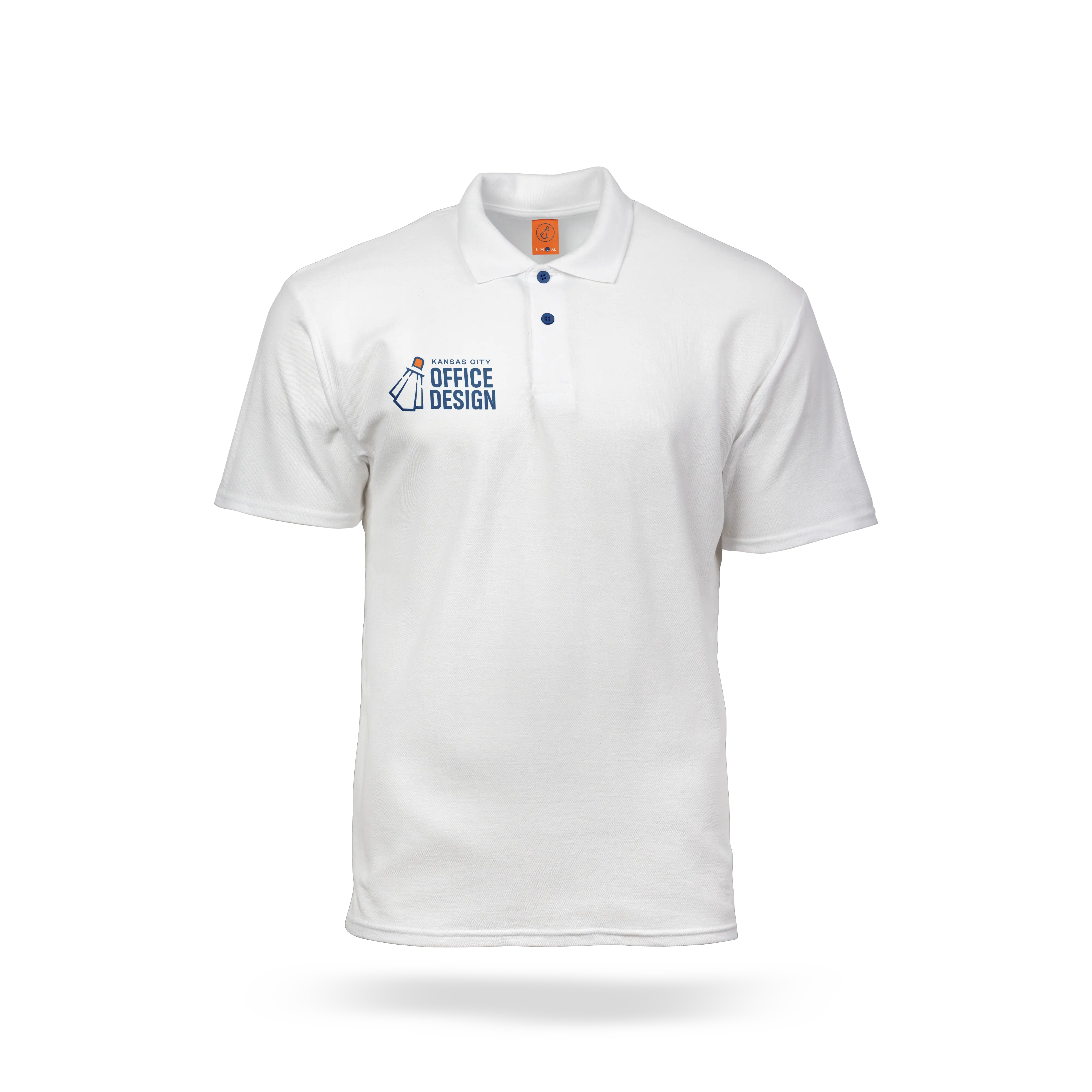
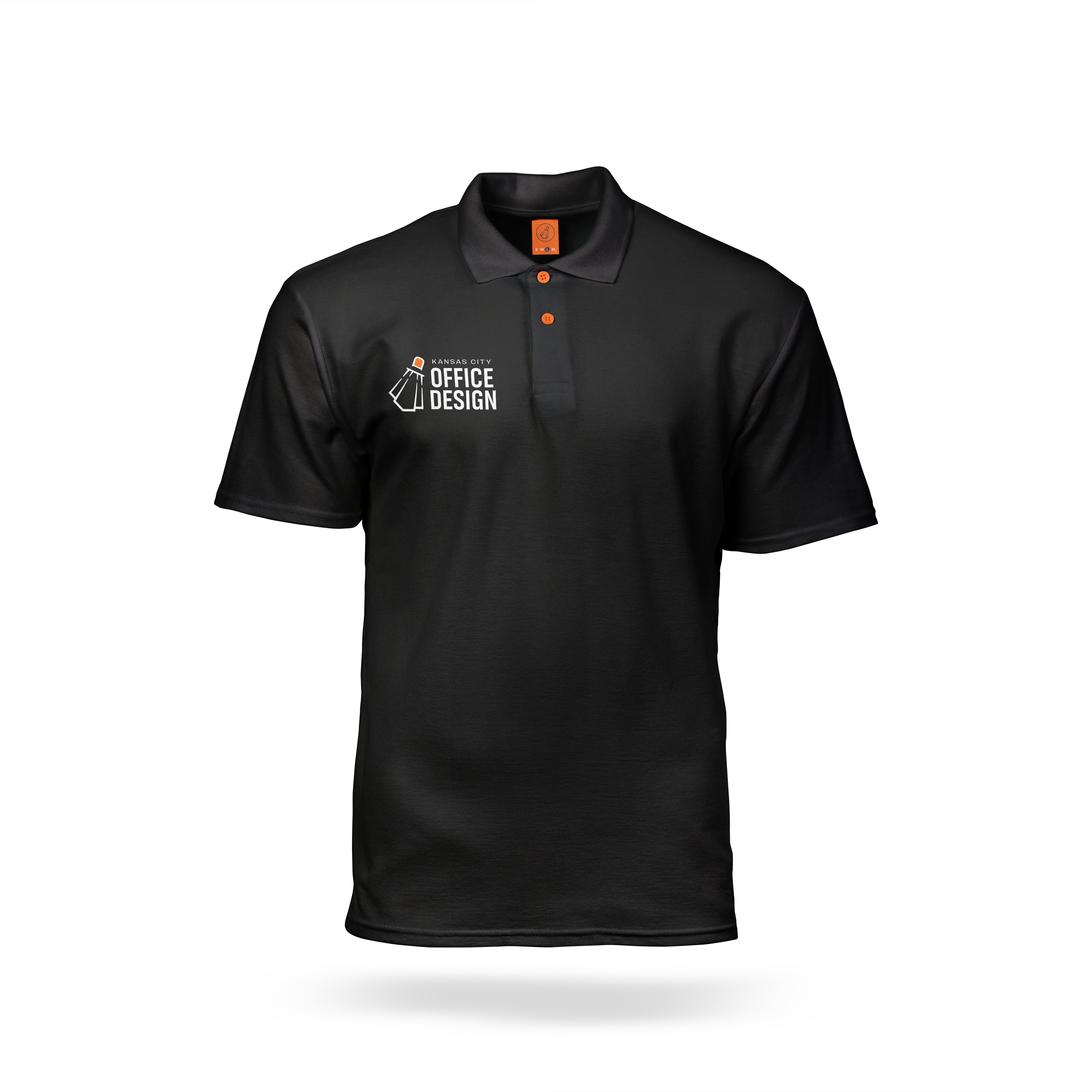
Full of character and energy with a story to tell, the KCOD brand mark is extremely versatile in its ability to be rotated at 4 different angles for a variety of applications.


On a mission to launch the online furniture buying experience into the 21st century.


Kansas City Office Design is a family-owned business that excels at designing and furnishing workspaces that are both aesthetically pleasing and highly functional. To develop a distinctive visual identity and launch their website user experience into the 21st century, KCOD enlisted the help of Relentless Design Co.

DELIVERABLES
Logo system
Color palette
Typography system
Patterns
Website revamp
UI / UX design
Lead generation
On & off-page SEOCHALLENGE
The previous logo was essentially just a typed font with no underlying meaning or story, which led to a lack of confidence in using it. Additionally, the website faced its own set of challenges, including organizing a large inventory with numerous product variants while also ensuring it was user-friendly and visually appealing.
Before


The feedback we've received on the new design has been overwhelmingly positive, and it's already making a significant impact on our business.
— Charles Johnson, Owner & Furniture/Spacial Consultant
BRAND MARK
PATTERNS


Before
After
Chair & table in perspective
High-rise office buildings in perspective
(1 for each company member)
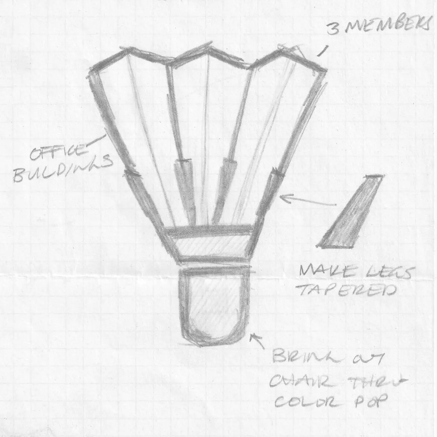
Desk lamp
The chair casts shadows of the office buildings and appears as if it’s lifting off
KCOD BLUE
654 C
100/71/10/47
0/58/112
#003A70
Calming
Soothing
Trustworthy
Professional
Friendly
We couldn't be happier with the exceptional work Miles did in redesigning our Kansas City Office Design logo. We initially started with one direction, but as we progressed, we realized a new concept would better represent our brand. Miles was incredibly flexible and responsive, pivoting seamlessly to embrace our new vision. He captured the essence of who we are, creating a logo that is modern, professional, and visually striking. His creativity and attention to detail were evident throughout the entire process, ensuring that our new idea was brought to life perfectly. The feedback we've received on the new design has been overwhelmingly positive, and it's already making a significant impact on our business. If you're looking for a talented designer who can adapt and deliver outstanding results, Miles is your go-to!
CHARLES JOHNSON
Owner & Furniture/Spacial Consultant
KCOD ORANGE
1585 C
0/61/97/0
255/106/19 #FF6A13
Happy
Fun
Energetic
Powerful
Attention-grabbing
On a mission to launch the online furniture buying experience into the 21st century.


BRAND IDENTITY
Connect with your audience through captivating storytelling and visuals that showcase your brand’s personality and voice across all things print and digital.
Click images to explore the possibilities.
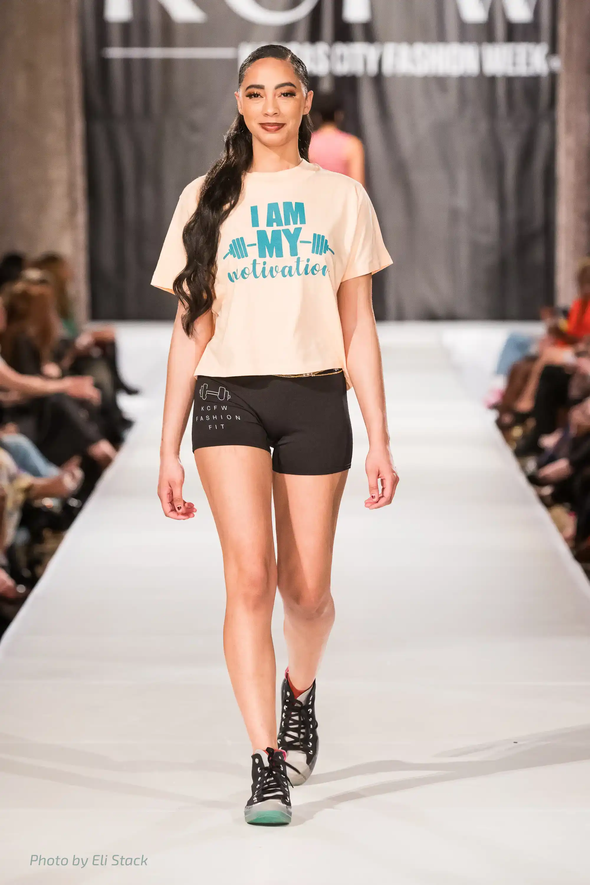
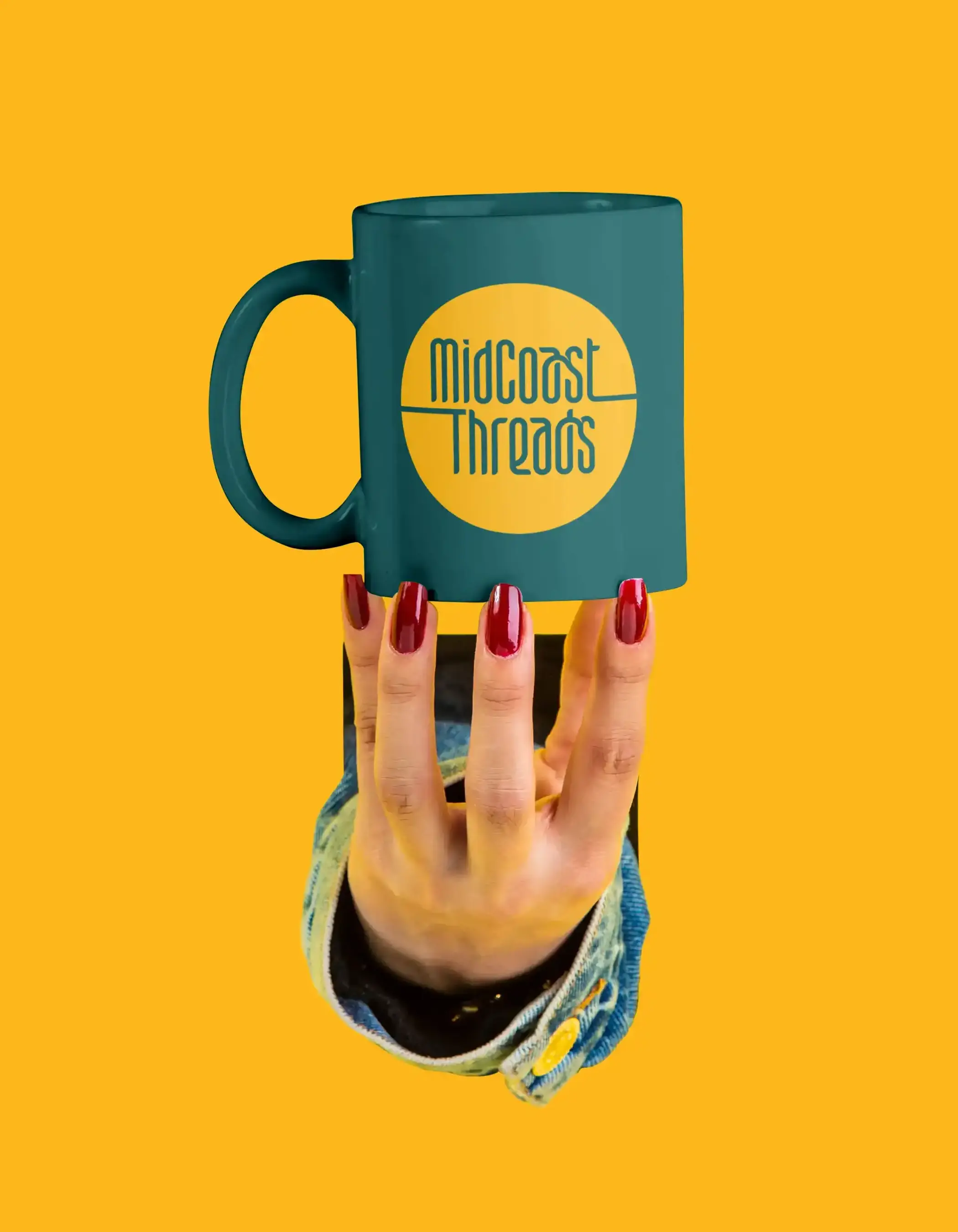
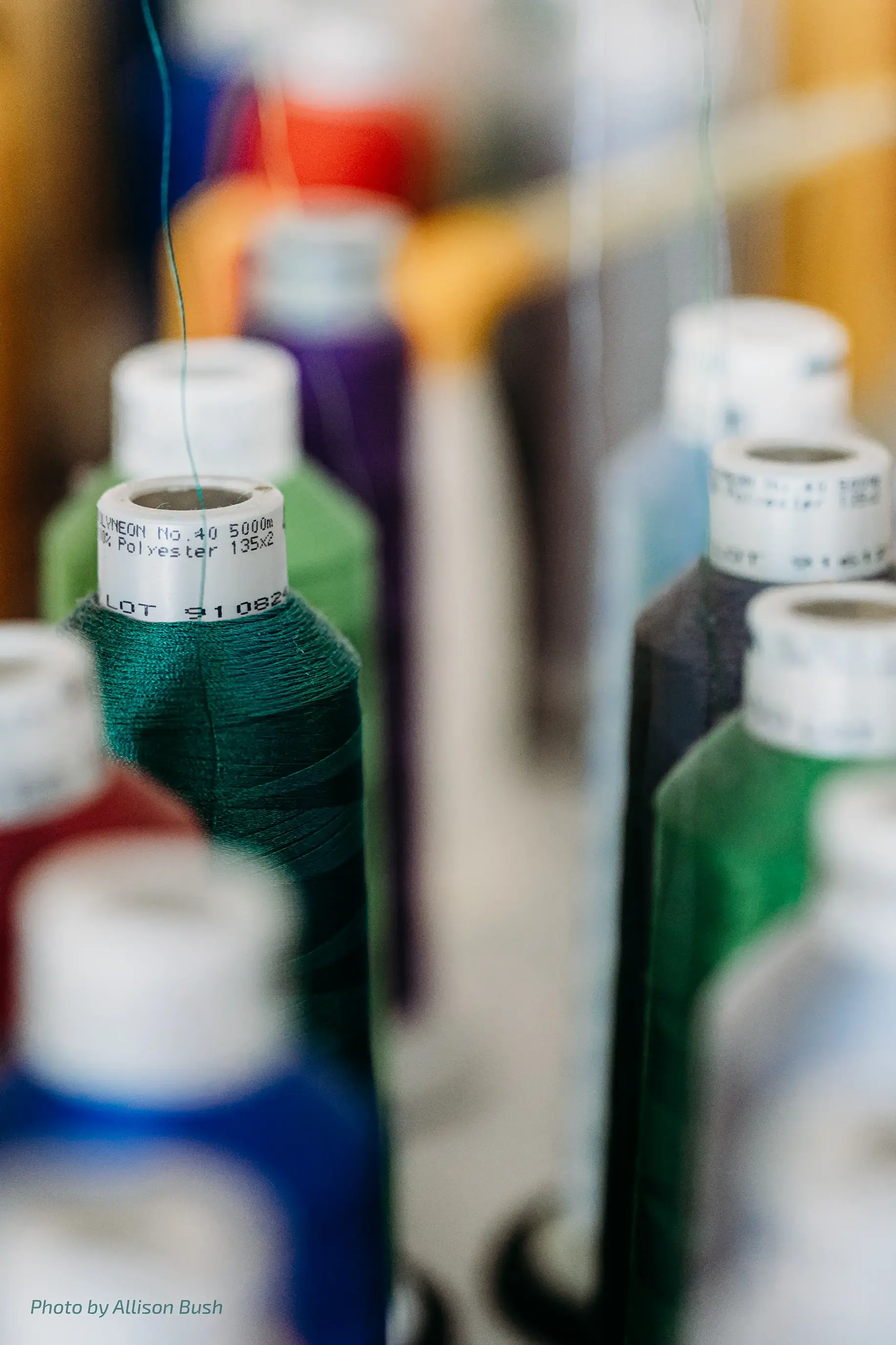
MidCoast Threads, a woman-owned screen printing and embroidery business based in Overland Park, Kansas, recently underwent a change in ownership. The new owner, Layne Whitehouse—an incredible individual, talented photographer, and current President of KC Fashion Week—contacted Relentless to create a new visual identity for the company.


OPE! Would ya look at that there—a happy little Kansas just nestles perfectly within the letterforms :)
AWESOMENESS ALERT!!!
You may have noticed a majority of the credited photography above was done by Allison Bush. Allison is a genuine gem of a human being and the founder and photographer of the non-profit, The Trixi Lou Project. Named in honor of her mother who was tragically taken by cancer in 2010, Trixi Lou was her 'stage name' so to speak; her alter ego, the character she created so she could be a little snarky, a little silly, and poke a little fun, all in love. The Trixi Lou Project helps curate lasting legacies through post-diagnosis photography, regardless of ability to pay. See some of her incredible work and learn more about the organization here.

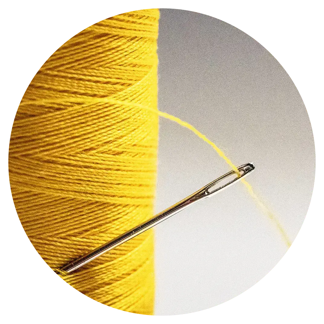

Rounded and sharp corners of each character mimic the nature of a sewing needle
Unique character ligature symbolizes Midwest hospitality and an arm over the shoulder
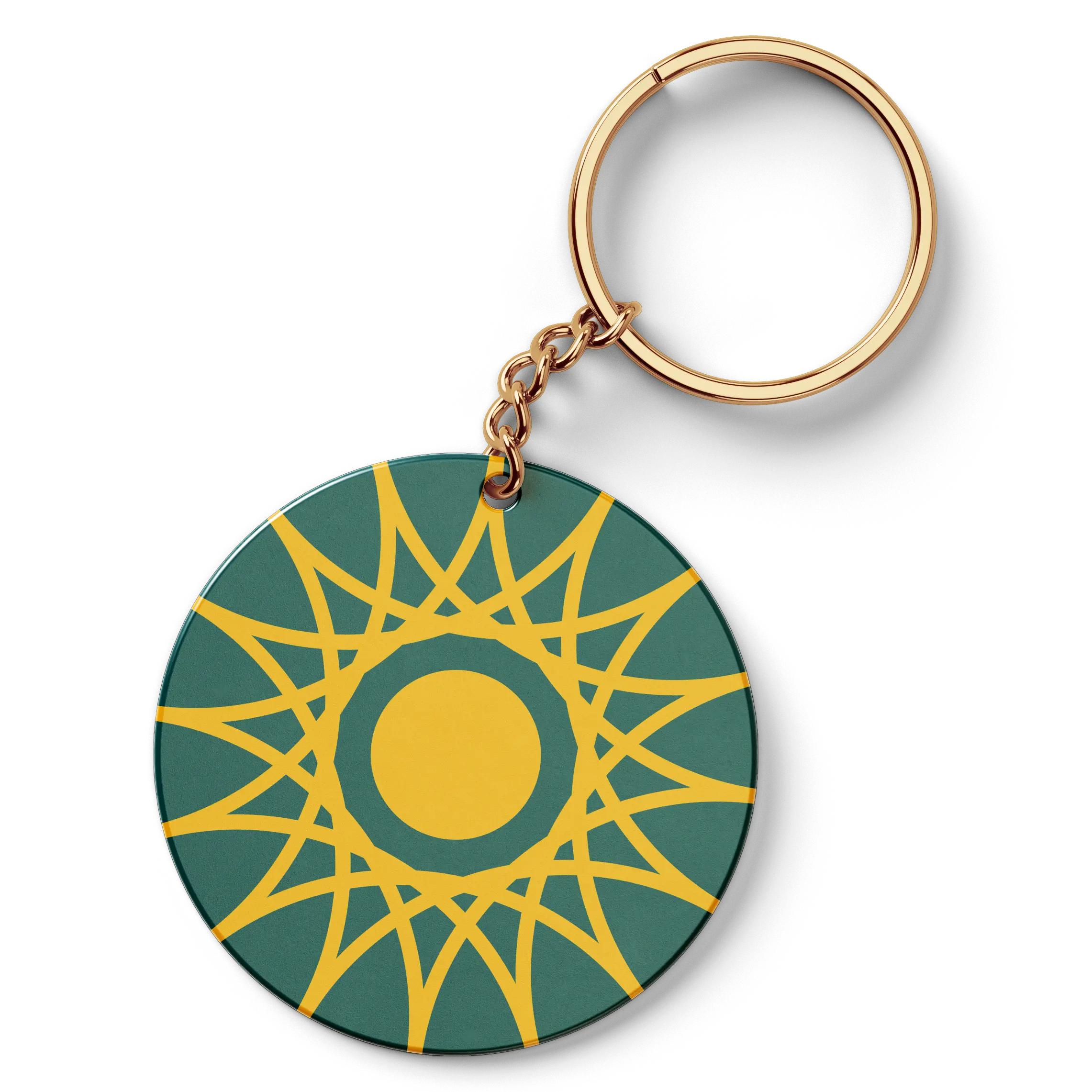
MCT TEAL GREEN
96/16/42/57
0/95/97
#005F61
Friendliness
Invigoration
Creativity
Calm
MCT GOLD-YELLOW
0/31/98/0
255/184/28
#FFB81C
Warmth
Joy
Energy
Happiness

Extended T’s mimic the stretchy nature of thread
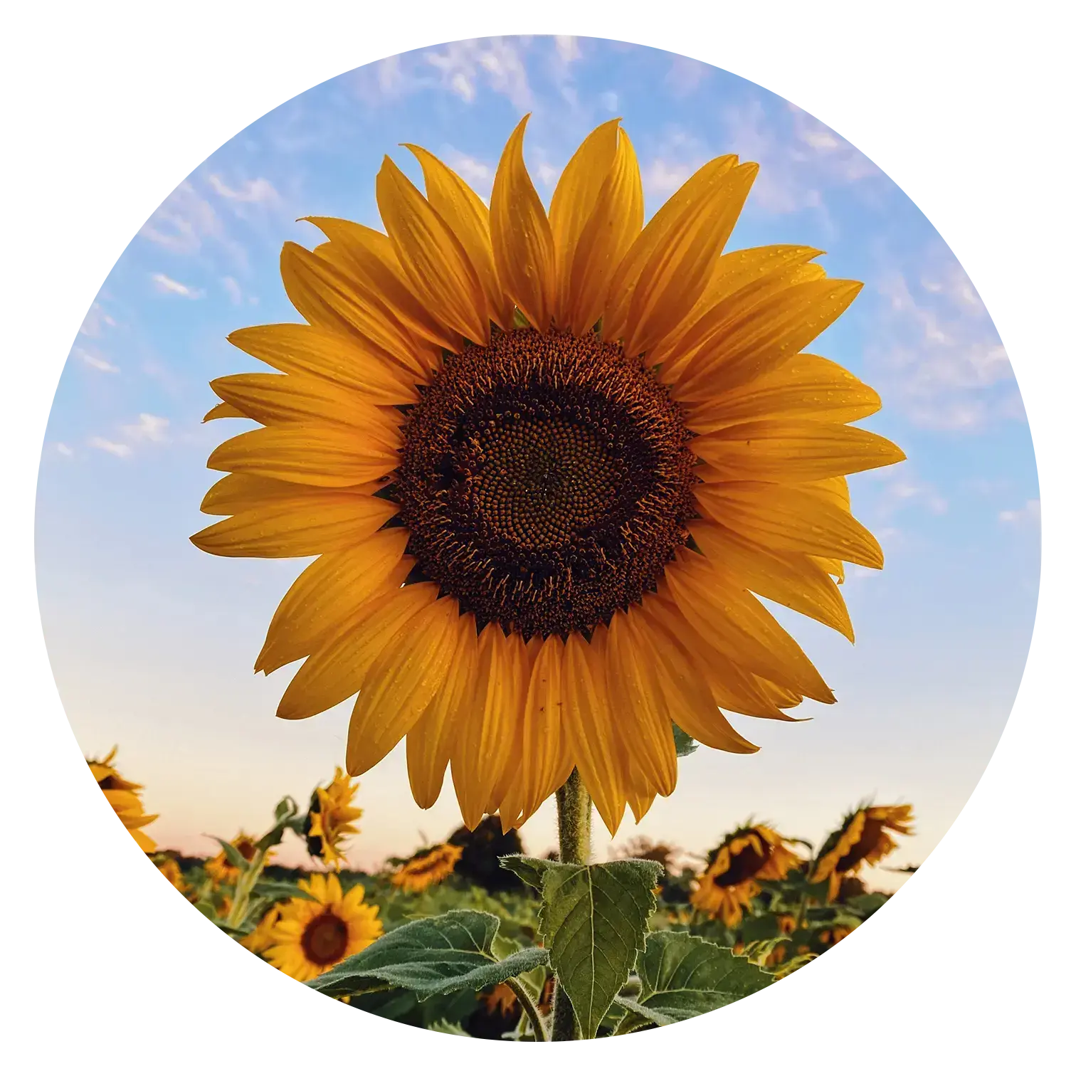
Yellow-gold circle symbolizes Kansas sunsets and sunflowers


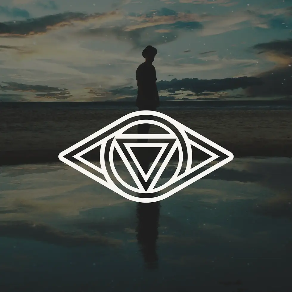
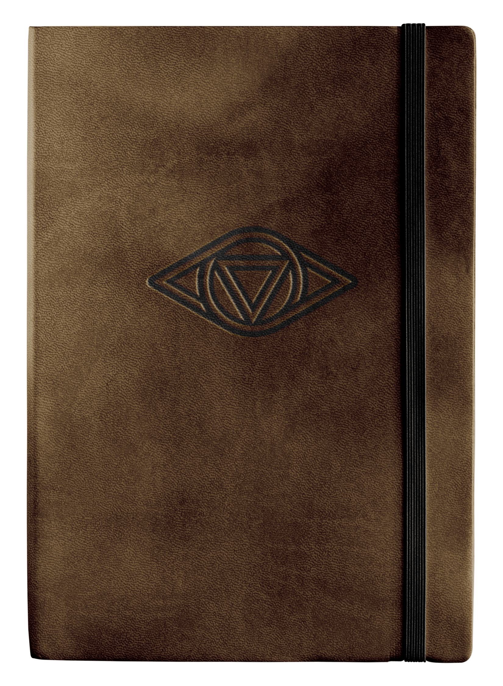
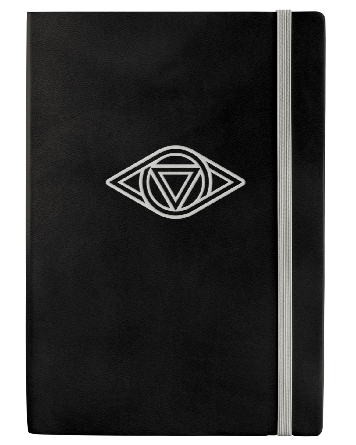
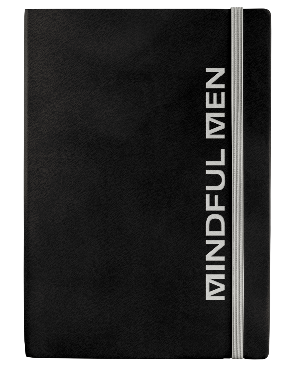
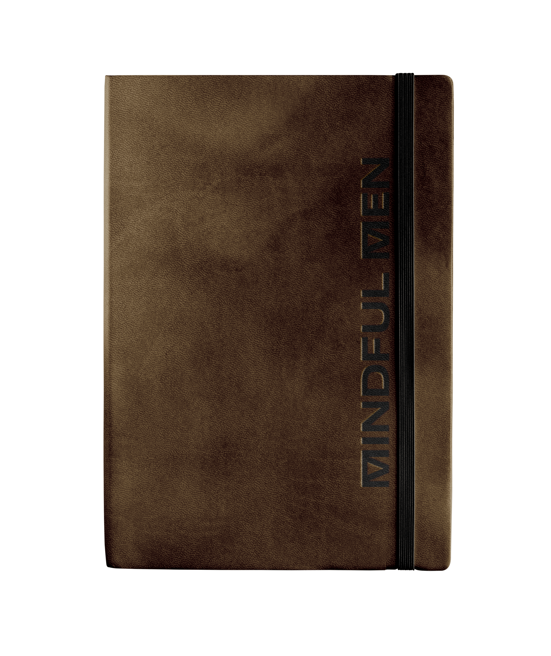
Mindful Men is a wellness brand dedicated to improving men’s mental health and overall well-being. In a world where traditional norms often discourage emotional expression, Mindful Men seeks to shift this perspective through its range of self-care products and supportive community. The aim was to design a contemporary, minimalist, and masculine logomark that embodies strength, connection, and self-awareness, complemented by a motto that reflects these values.


.webp)

Mindful Men is a wellness brand focused on men’s mental health and well-being. In the “boys don’t cry” society we live in, Mindful Men is aiming to change that narrative through their self-care products and community. The goal was to create a modern, simple and masculine mark that portrayed strength, connection and reflection.
The Mindful Men logomark combines two of nature’s most enduring shapes, the circle and the triangle, to create an abstract representation of the third eye and evoke the image of aviator wings. The negative space within the design suggests that while one may occasionally feel incomplete internally, the core remains resilient and steadfast. The strong, bold accompanying typography reinforces this idea, symbolizing how the community aspect of Mindful Men provides support and fills any perceived gaps.
Composed of the two strongest shapes found in nature, the circle and triangle,
the Mindful Men mark is an abstract take on the third eye that also mimics aviator wings.
The negative space within the mark signifies that even though we may not always feel
complete on the inside, the foundation is still sturdy and can weather the storm.
The boldness of the supporting typography carries the weight and fills that void —
a play on the community aspect of Mindful Men.


.webp)


.webp)
8” x 4” bi-fold bracelet packaging printed on 130# Desert Storm cover stock.


MM BLACK
67/64/67/67
45/42/38
#2D2A26
MM DARK BROWN
62/60/76/66
51/46/32
#332E20
MM LIGHT BROWN
54/60/77/53
75/61/42
#4B3D2A
MM VIVID WHITE
0/0/2/3
246/245/240
#F6F5F0


.png)


The following visual elements are inspired by Ouija, oddities & the occult. Together, they encapsulate the personality and style of the uber talented nail alchemist, Keely Shea (@clawsbykey).

.jpg)

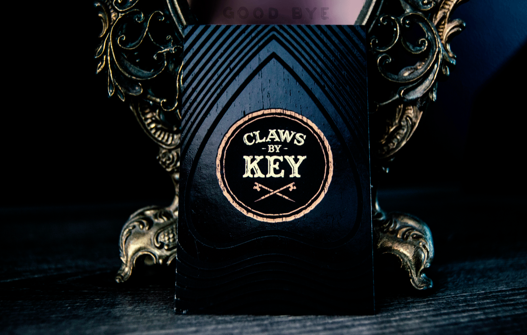


The badge framework draws inspiration from the window cut-out of an Ouija planchette, with a distressed texture added to evoke the look of claw scratches.

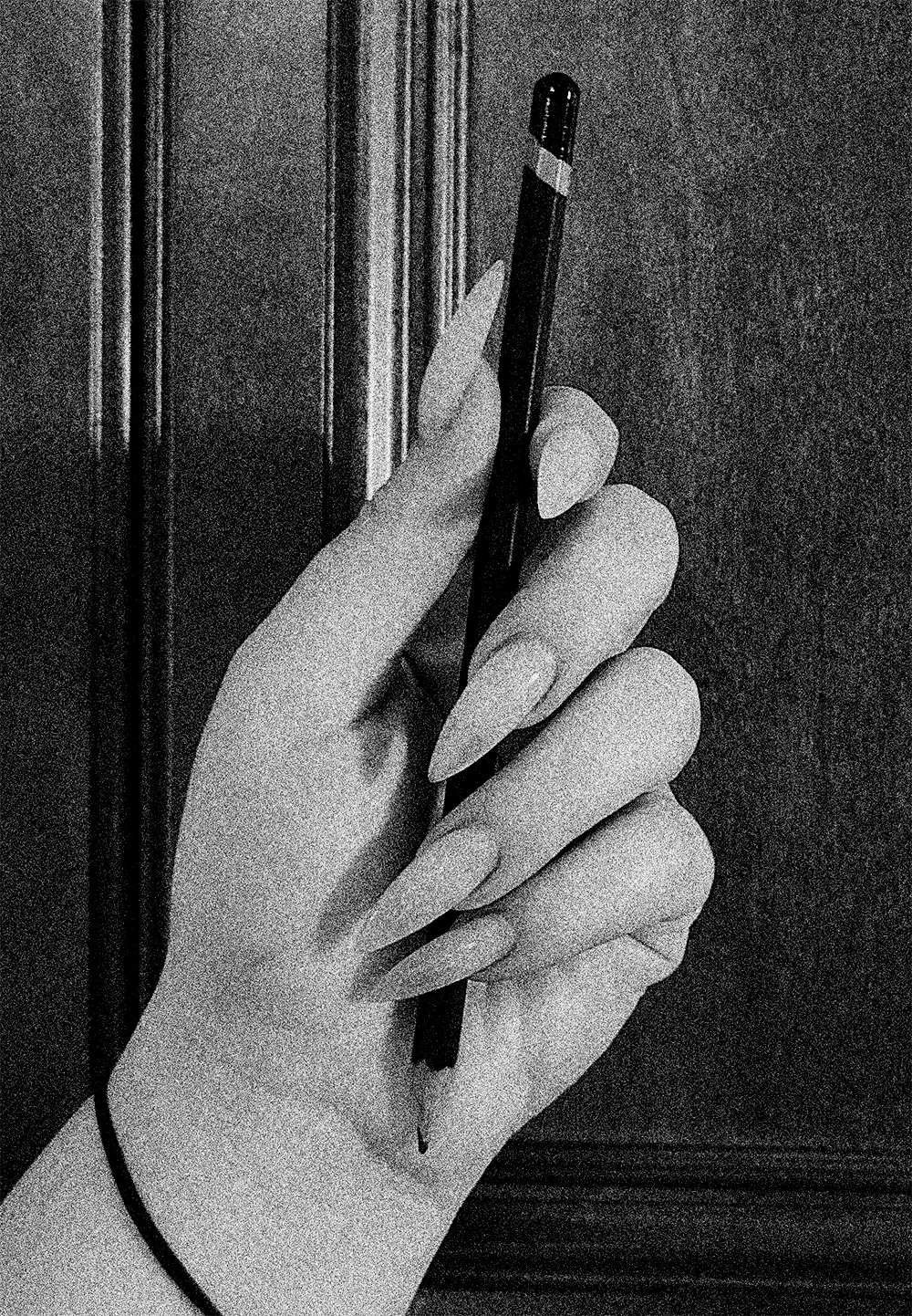
Skeleton key + detail brush tops in shape of “K”

When the client lends a hand ... Literally.

Layering in extra grunge and distress textures enriches detail and adds greater visual depth for both print and digital applications at larger sizes


Radiating Ouija planchette design in spot gloss varnish produces a black-on-black effect that shifts at different viewing angles.
CLIENT SUMMONING CARDS
Euro-style card size (3.375" x 2.125") that emulates a Ouija board.


.png)


VISUAL IDENTITY // PRINT DESIGN

PROPOSED VARIATIONS
TYPOGRAPHY & COLOR PALETTE
2188C
CMYK: 100 / 78 / 34 / 20
RGB: 15 / 66 / 107
CMYK: 0 / 0 / 0 / 7
RGB: 237 / 237 / 238
PRINT COLLATERAL
8ft x 8ft fabric backdrop banner


UNCHOSEN CONCEPT & VARIATIONS


Relic Powder Coating was in need of a logo identity
and various print collateral designed for the
launch of the newly formed company. The goal was
to create a weathered and grungy logo with
a vintage aesthetic for use across various print and
digital applications. The solution pays homage to
retro vintage design, while adding a grungified twist.


.png)

Base Font: Number Five Smooth
Modified
Base Font:
Number Five Smooth

Relic Powder Coating was in need of a logo identity and various print collateral designed for
the launch of the newly formed company. The goal was to create a weathered and grungy logo
with a vintage aesthetic for use across various print and digital applications. The solution pays homage to retro vintage design, while adding a grungified twist.


NAMING & CONCEPTING // BRANDING // PRINT DESIGN
Eudaimonia is a fictitious cannabis-infused wine that aligns you with your higher self and opens your eyes (then slightly lowers them) to all of the beauty that surrounds us, while encouraging you to live your best life.
Based on Aristotle’s Aristotelian ethics, Eudaimonia is the condition of human flourishing or of living well. The design style pays homage to the Art Deco era and 1920s medicine bottle label design, while adding in a modern-day twist and a whole ‘lotta shine and movement.

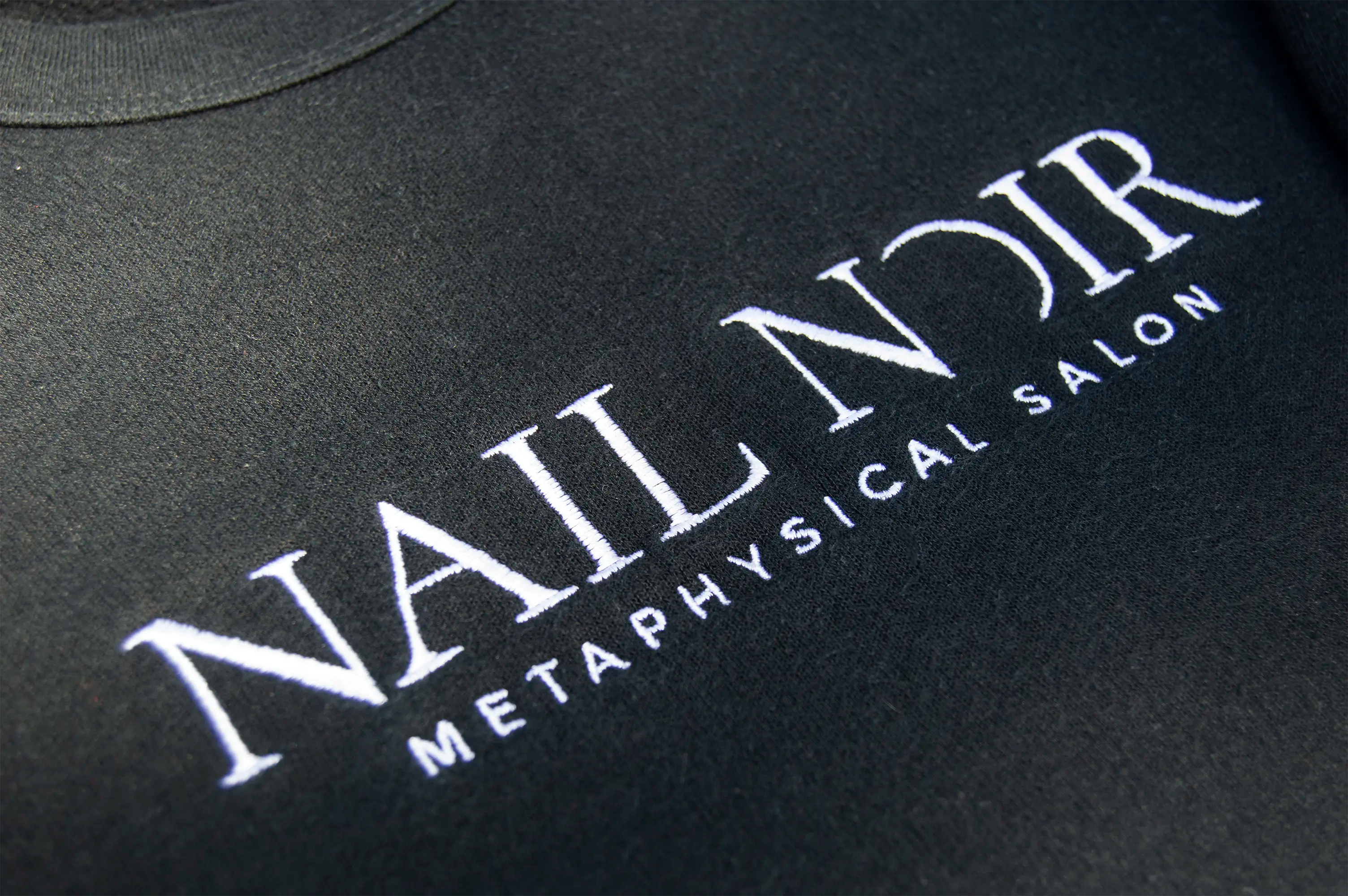
Nail Noir is Kansas City's first and only premier metaphysical salon, offering a unique blend of services, including dry manicures, intricate nail art, tarot and oracle readings, and mediumship. We had the honor of naming the brand and crafting the identity, which naturally extends into owner Noelle Brown’s personal sub-brand, Noelle Noir. The aim was to develop unique identities that resonated with Noelle’s vision and core values, while highlighting her signature aesthetic—particularly her admiration for the color black and her deep connection to the moon.
.png)
Nail Noir’s signature line of premium handcrafted cuticle oils were each named after 3 prominent Greek goddesses: Aphrodite, Athena & Nyx. Each label design incorporates notable elements that each goddess was most known for. In addition to the label design, we also crafted the following slogan for use in marketing efforts ...


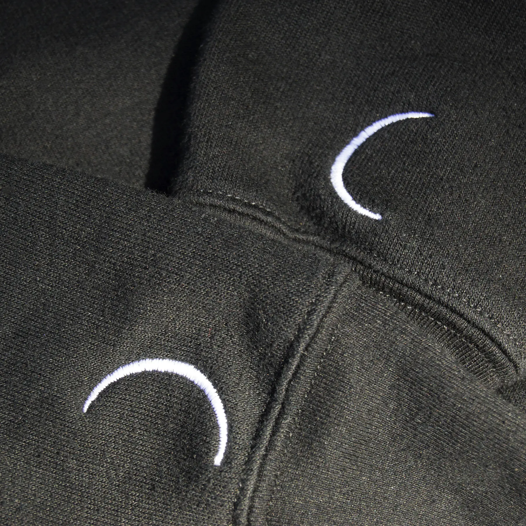
Fingernail + Eclipse


Product naming, print design and photography for Nail Noir’s Pain Elixir—a magical blend to relieve minor aches and pains, strains, bruises, and cramps.
Experience the full Nail Noir website here


Nail Noir’s signature line of premium
handcrafted cuticle oils were each named
after 3 prominent Greek goddesses: Aphrodite,
Athena & Nyx. Each label design incorporates
notable elements that each goddess was most known for. In addition to the label design,we also crafted the following tagline for use in marketing and promotional efforts ...


Video by Dylan Trigg - Triggered Media


Raised digital silver foil brand mark
Raised spot UV logotype


With Noelle’s rising prominence and the increasing demand for her tarot, oracle and mediumship services, we developed the identity for her sub-brand, Noelle Noir. This identity was then utilized to design a distinctive pop-up banner for conventions and special events.

The reflected ‘N’ monogram forms an 8 in the negative space—the number for the Strength card in tarot, which is tattooed on her forearm.

31.5” x 85” fabric pop-up banner with matching black hardware. The design is a blend of Art Deco meets gothic-occult, which incorporates the Nail Noir eclipse brand mark into each corner of the framework.


.png)


